
How To Emulate Clay Using Photoshop #Tutorial
- Behind the Scenes
- Tutorials
- Kids & Families
- Posted by Stefanie Zaarur on November 27 2018
Share Tweet
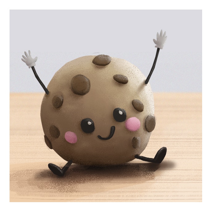
Fraeya Pinto is a BG Painter working out of Brown Bag Films Toronto. Recently she started exploring clay and how she could integrate it into her work. This quickly developed into a personal challenge to use her photoshop skills to emulate the look of clay, first through a photo study, resulting in the sushi piece below, and then moving onto an original painting of a cookie.

Fraeya was kind enough to give us a little insight into her process in the hopes of helping others achieve the same result.
Here's what you need to consider when trying to emulate clay:
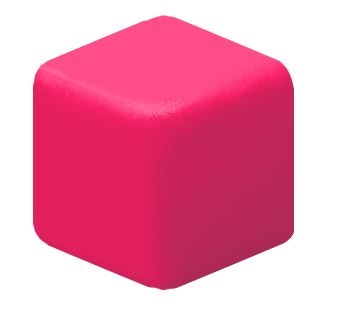
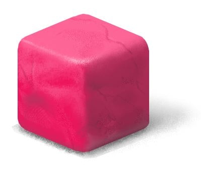
1. LIGHTING
I start by laying out my tones. I'll paint everything flat, then lay in large shadow and light shapes.
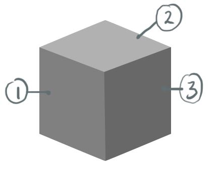
1. This is your base tone. When we get to colour, it will be the most saturated part of your object (keep this in mind for later).
2. This side reflects light and so will be lighter in value. When it comes to colour, it will also be more desaturated than your base tone.
3. Shadow - This is the darker part, less saturated than your base colour.
2. EDGES
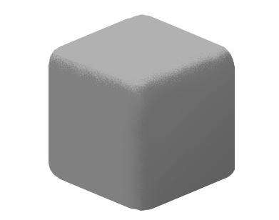
How does light fall off your object? Plastics,for instance, are hard, so you will have sharper edges. Clay, on the other hand, is quite soft. So, we soften out edges. The shadow will have a gentler, more gradual falloff. I used a scatter brush to do this and lightly painted over the hard edges.
3. LIGHTING
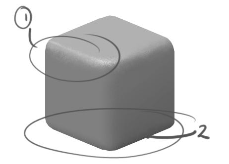
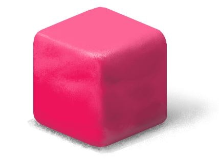
Specular and Occlusion:
1. Specular (your highlight) is the brightest part of your object. It's where light from your source hits an object most directly.
2. Occlusion, on the other hand, is the darkest part. In this case, where our cube touches the ground.
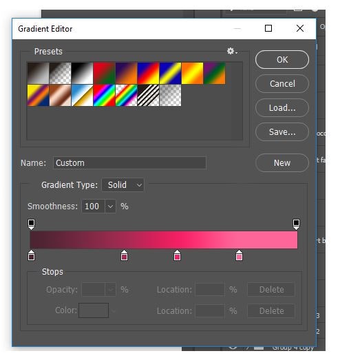
4. COLOUR
There are a billion ways to do this, but what I like right now, is this: take your greyscale object, and throw on a gradient map. You'll lose your darkest darks and brightest brights, but you know where they are, and you can paint them back in. What you will get, is your base colours pretty accurately laid out. I set my gradient map to look like this for this cube
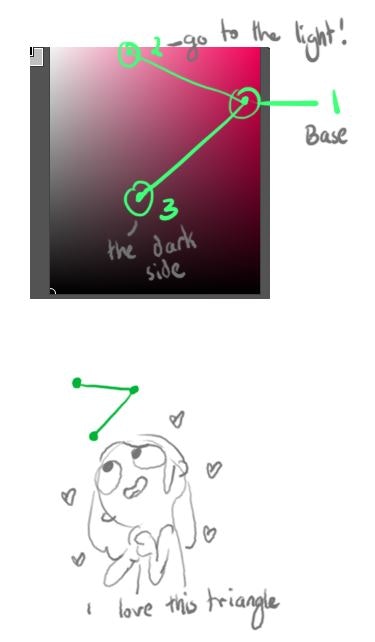
How and why did I pick those colours on the gradient map? This is important!
Think of colour as a triangle (we'll just stick with value for now, and not worry about warm and cool light). Your base colour will be your most saturated point. Your highlights will be desaturated as will your shadows.
I'm very visual, so picture a triangle with the point being your base, and the legs being your highlight and shadow. Pick the colours in your gradient map to roughly match that, and play with it until your cube is coloured the way you want.
5. DETAILS
Last come the details!
Painting in the little nuances, like thumbprints and where the plasticine is starting to crack. I broke this down into two steps; first is softening the cube shape. Make it look like it has dents and divots. You have your overall values laid out, so colour pick from there to paint in more highlights and shadows.
Second are the small details. Cracks, thumbprints etc. The trick to this is…there is none. It's just observation, so my best suggestion is to look for loads of references of your materials and paint.
If you're attempting to emulate clay we hope this tutorial guided you in the right direction! We'd love to see your progress and the awesome stuff you're working on, so don't hesitate to share with us.
Also, if you have any specific tutorial requests, comment below with your suggestions and we'll do our best to get them up!
Stefanie Zaarur
We Love Animation®
Brown Bag Labs is an exciting online space, brought to you by Brown Bag Films. We share great content for families as well as behind the scenes fun and tutorials from the Brown Bag Films team.
Get our great newsletter!
Get our great newsletter!