
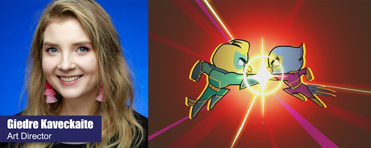
We Go Behind the Scenes with Powerbirds Art Director Giedre Kaveckaite!
- Behind the Scenes
- Kids & Families
- Posted by Rachael Rothwell on January 30 2020
Share Tweet
Did you know our NEW preschool animated adventure series, Powerbirds, premiered on Sunday, January 19 on Universal Kids?
Created by two-time Pulitzer Prize-winning editorial cartoonist Steve Breen and co-created by Jennifer Monier-Williams, the show centers on Max, an imaginative six-year-old whose love for comic books, action figures and adventure comes from his Grandpa Felix, and his beloved pet birds.
Earlier this week, we took a peek behind the animation curtain and chatted with Powerbirds’ Director Bill Gordon and now we want to soar back in with some more behind the scenes peeks at our feathered heroes with Powerbirds’ Art Director Giedre Kavekaite!
Hey Giedre! Can you tell us a little bit about the role of an Art Director?
An Art Director on an animated series usually works with a team of artists and helps to establish the look and feel of a show at the very beginning of the project. It includes a lot of different areas: character designs, environments, props, lighting effects, special effects and colour keys… the list goes on! There’s a lot of communication with the Series Director, to make sure the artwork fits their vision.
Once we start working on the actual episodes, my job includes reviewing the artists' work daily and guiding them to ensure we are consistent with our design language. Every design must fit seamlessly into the show’s world no matter who designed it. On top of all that we keep an eye on deadlines and schedules. Time management is a key part of my role, since one department must hand over finished episodes to the next department in a timely manner so they can start and finish on schedule.
Can you tell us a bit about how you got the role of Art Director on Powerbirds?
At the beginning of last year, I was finishing up my Art Direction job on Nella the Princess Knight season 2 here at Brown Bag Films Manchester. I had a great time working on it and was looking forward to a new challenge.
Luckily, I then got the opportunity to interview for the Art Director position on Powerbirds. Art Directors are not only hired by the studio they work in, but also the client, so we must interview and apply each time to ensure our style and sensibility is a fit for the shows we’re making. I was super fortunate to get it!

What was your process when designing the look of Powerbirds?
The visual development was already underway before I joined Powerbirds. Together with a super talented Consulting Art Director, Saud Boksmati, we developed and expanded the existing concept art. We had to figure out what areas of the original designs were working, and which needed a little more development.
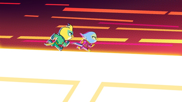
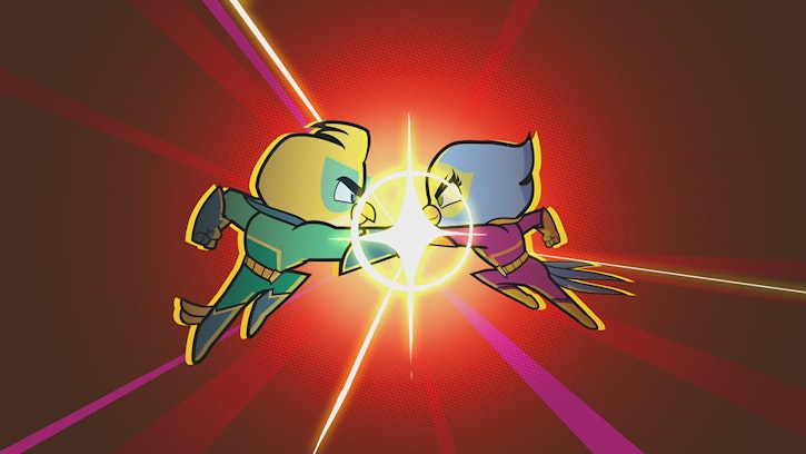
Powerbirds is set in two worlds, the real world and the comic book one, where Ace and Polly become superheroes. We were mindful that they needed to be visually quite different from each other! We wanted the comic world to feel more dynamic, fun and resemble traditional comic art. We referenced numerous well-known comics including Spiderman, X-Men and Batman, you name it we looked at it! What made them exciting were the dynamic posing, low and high camera angles, dutch angles and extreme perspectives.
The colours of retro comic books are one reason they are so recognisable. The comic book printers used a CMYK colour palette which had a limited range of shades. CMYK means every colour is made of Cyan, Magenta, Yellow and Black ink only!
The different coloured ink would be layered on top of each other to create the shade needed. When colours didn’t line up perfectly, there would be tiny errors in the print, the printer would leave yellow, pink and blue streaks on the page. To incorporate this, we used a limited 64 colour palette, high contrast values, small colour imperfections and a dash of dotted half tone in our backgrounds to give a little nod to our reference material!
We also kept the shapes very geometric and simplified for a clean graphic look.
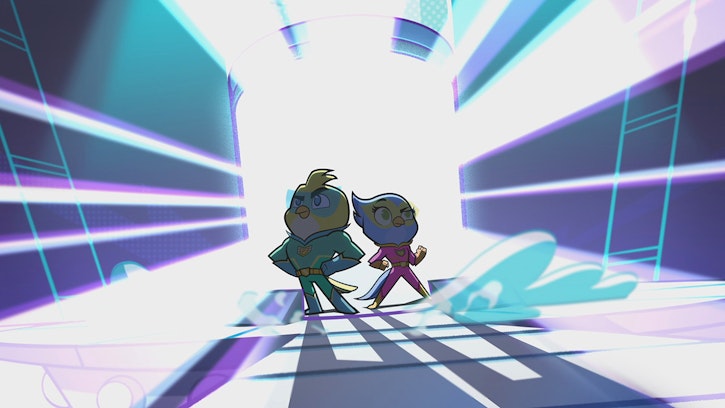
To contrast our comic world, the real-world palette was more expansive, but muted and pastel toned. The shape language was rounded and appealing, but the camera angles and cinematography overall was a bit more straightforward, it made it feel more stationary and rigid, compared to the comic world which is lively and bursting with colour!
What was the most difficult challenge you encountered in Art Directing Powerbirds and how did you overcome it?
The most difficult, yet the most fun challenge was designing the opening sequence for the show and the Powerbirds’ transformation sequence! The storyboards were so dynamic and cool, I really needed to do them justice.
There were so many moving pieces and every shot was seamlessly blending into the next, so every effect, transition, colour shift needed to be designed meticulously, so that our client, series director, background artists, effects artists, animators and compositors would know the final look we were going for before we all dived into making it!
I believe I ended up designing and painting 78 different panels for the opening sequence. It was probably my favourite challenge this entire project!
What do you feel makes Powerbirds unique?
The show takes place in two different worlds with two different styles, so you get two shows in one! And there’s also a super ear worm-y theme tune that I still can’t get out of my head daily!
You can check out the adventures of our feathered heroes, the Powerbirds, on Universal Kids. And also take another peek behind the scenes with Powerbirds’ Director Bill Gordon!
Rachael Rothwell
We Love Animation®
Brown Bag Labs is an exciting online space, brought to you by Brown Bag Films. We share great content for families as well as behind the scenes fun and tutorials from the Brown Bag Films team.
Get our great newsletter!
Get our great newsletter!