
“The Bazaar” Illustration in Photoshop #Tutorials
- Behind the Scenes
- Tutorials
- Posted by Eoghan.Lynch on August 13 2019
Share Tweet
Looking to brush up on your Photoshop skills, we've got you covered with this illustration #tutorial by one of our Dublin studio 2D Designers - Lynne Guthrie!
We caught up with Lynne who walked us through her process on her piece “The Bazaar” from start to finish!
Lynne:
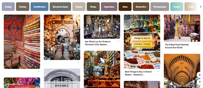
Step One - Research:
Searching for reference images is
Once you
It also helps with difficult lighting and angles and may give you some new ideas and details to add to your piece!
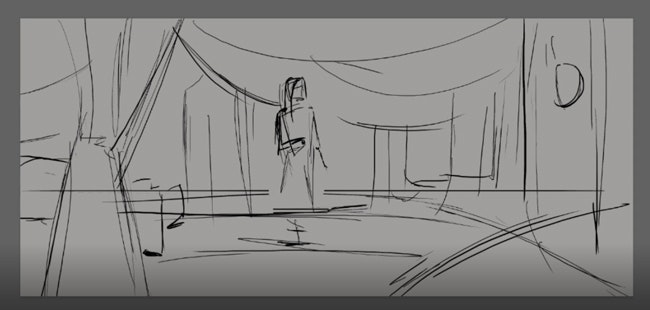
Step Two - Sketch: I like to start with a light grey background as white can be very harsh on your eyes (they’re kind of important and I’ve heard they don’t grow back). This also gives you a more natural base for the next step of adding in tone.
I use a simple sketching brush from Kyle T. Webster to plot out my scene, bearing in mind: How can I tell the story of this piece in a pleasing composition? Where are the characters going to go? Where is my horizon line? What is the perspective? What do the world and characters look like? and so on.
You should spend a lot of time on this step as it is unbelievably important to have a strong composition and story, as these elements are time-consuming to change at a later step. I would recommend sketching a few small thumbnails and choose one

Step Three - Tonal Value: Establish the foreground, mid and background planes using
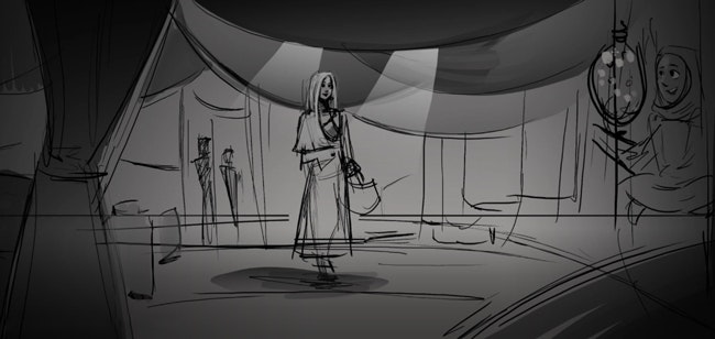
Lighting is
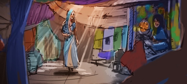
Here I am using the gaps in the overhanging cloth to paint in rays of light to illuminate our main character and bring attention to her because let’s face it that dress is ‘finger snap’ worthy.
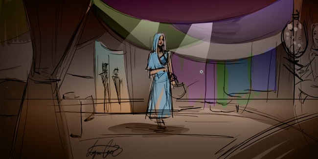
Step four - Colour: Now for the terribly confusing but fun part - colour!
I wanted to inject a lot of colour into this scene so I blocked out strong colours for the fabric hanging around the woman
I also tried to stay away from cool colours for the environment as the climate is warm, the terrain is sand and it helps to contrast with the main character’s blue dress.
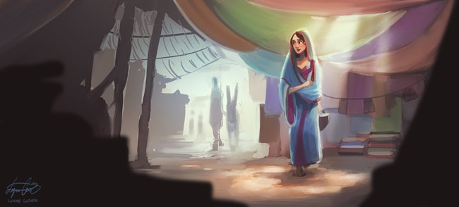
The story changed also
Step Six- Detailing: The last step is those final details
I am sure, you have all heard that ‘practice makes perfect’, but nothing is perfect in life.
“Done is better than perfect.”
Daily practice, no matter what you are drawing, will improve your skills.
I often feel guilty about painting from film stills or just sketching people on the bus because it is not as creative as
It is so easy to scroll on social media instead because you may feel that those studies or sketches are not your ‘best work’. But that’s the thing to realise, that EVERYTHING you do helps you learn, and you will be so much happier after creating something, even if it is a simple sketch, than procrastinating and doing nothing. Comfort zones are great for these challenging times, and I just want you to know that you’re not alone.
And after that motivational Shia LaBeouf moment, I shall leave you with some inspirational concept artists that have so much knowledge to learn from and some of them even create video process tutorials that are an amazing source of knowledge.
Gavin O’Donnell, Ben Simonsen,
Now put down your phone and pick up your pencil! Love from your fellow procrastinator, Lynne. <3
If you want to check out more of Lynne's fantastic artwork, you can visit her Instagram - @lynniedrawsart
Eoghan.Lynch
We Love Animation®
Brown Bag Labs is an exciting online space, brought to you by Brown Bag Films. We share great content for families as well as behind the scenes fun and tutorials from the Brown Bag Films team.
Get our great newsletter!
Get our great newsletter!